The goal of the app is to provide planners with the tool to check in their attendees as quickly and efficiently as possible. The faster an attendee checks in to the event, the faster they can begin to engage and get what they want out of the experience.
The app is currently being used at various events in Toronto and internationally.
Problem Definition
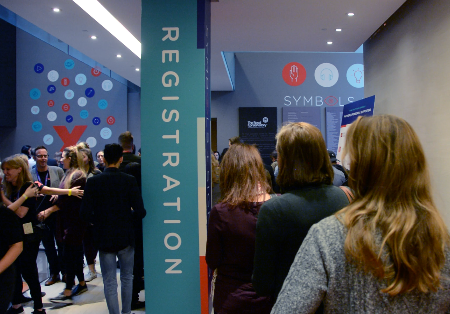
Imagine you’re attending an event, one you’ve been looking forward to for a while. You enter the conference hall or concert venue where the event is taking place, and note with dismay that there is a big line between you and the check-in desk.
Now imagine you’re the planner of that same event. You’re worried that your check-in staff can’t find people fast enough on their paper lists and attendees will become upset that they missed the first speaker while waiting in line. The speaker herself isn’t too pleased that her auditorium is only two-thirds full.
So what went wrong?
Events are high-stress for planners at every phase, but the onsite registration and opening of the event is one of the highest stress points of the event cycle. So many things can easily go wrong like ensuring volunteers know what to do, that attendees arrive at the correct entrance and have the correct documentation to prove their admission, and that the speakers are primed and ready to shine.
No matter how long the planner schedules the time window for registration, she knows that most of the attendees will arrive in the final 10% of that window. This creates a bottleneck which can be tightened further by lack of resources of space and check-in kiosks, attendee confusion due to lack of proper signage and wayfinding, and most importantly, an inefficient system for the recording of check-ins. Say, like pen and paper lists, which are the current industry norm.
I had my work cut out for me, so I conducted a two-day spike to research competitors and get a better understanding of the problem space.
Competitors
I was seeing a lot of patterns of simple check-in lists, but it became clear that the interaction of checking someone in was a large part of the experience, and many apps missed the mark. Dragging is simply too much, but tapping can be equally different if the target is too small. If the target is too big, staff may accidentally check someone in, and if the list is filtered to only show pending people, that mistake could disappear before it could be corrected.
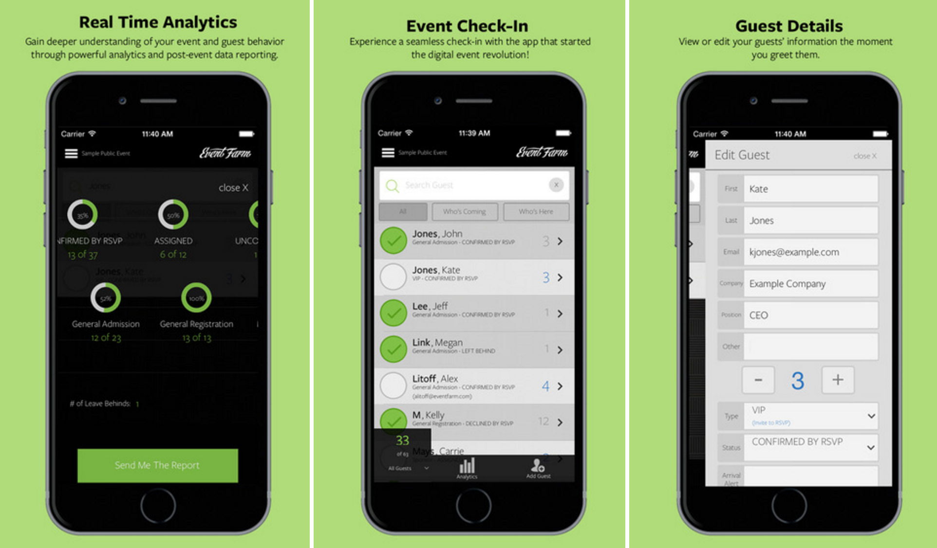
EventFarm
Attendees who have arrived are labelled as "Who's Here", which reduces cognitive load. This is a good example of a very simple use case because the view is not customizable, but it's quite simple and contains most of the functionality I would need except badge scanning.
EventBrite
EventBrite gives users the ability to sell tickets onsite as well as check in attendees, but their drag functionality (swipe right to check someone in) is a bit clumsy and hard to discover. When planners are trying to check people in as fast as possible, they're going to be annoyed with a swipe when a tap can do the same job. On the plus side, their analytics section is logical and concise.
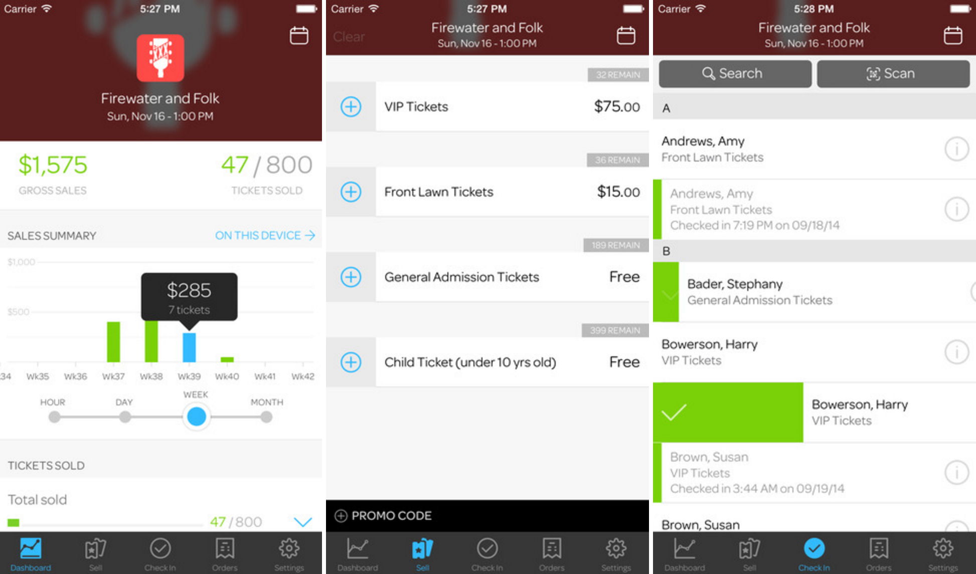
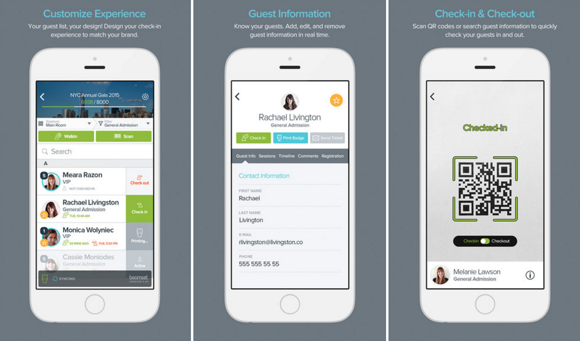
Boomset
Boomset includes a status bar at the top of the screen to remind planners how the event is going, and it's nicely out of the way. Unfortunately there is a lot going on all over the screen, and the primary green colour is used a bit too much to really direct the user to the true primary action (checking someone in). This displayed the importance of reducing friction between the user and the task they want to complete; making things as obvious as possible.
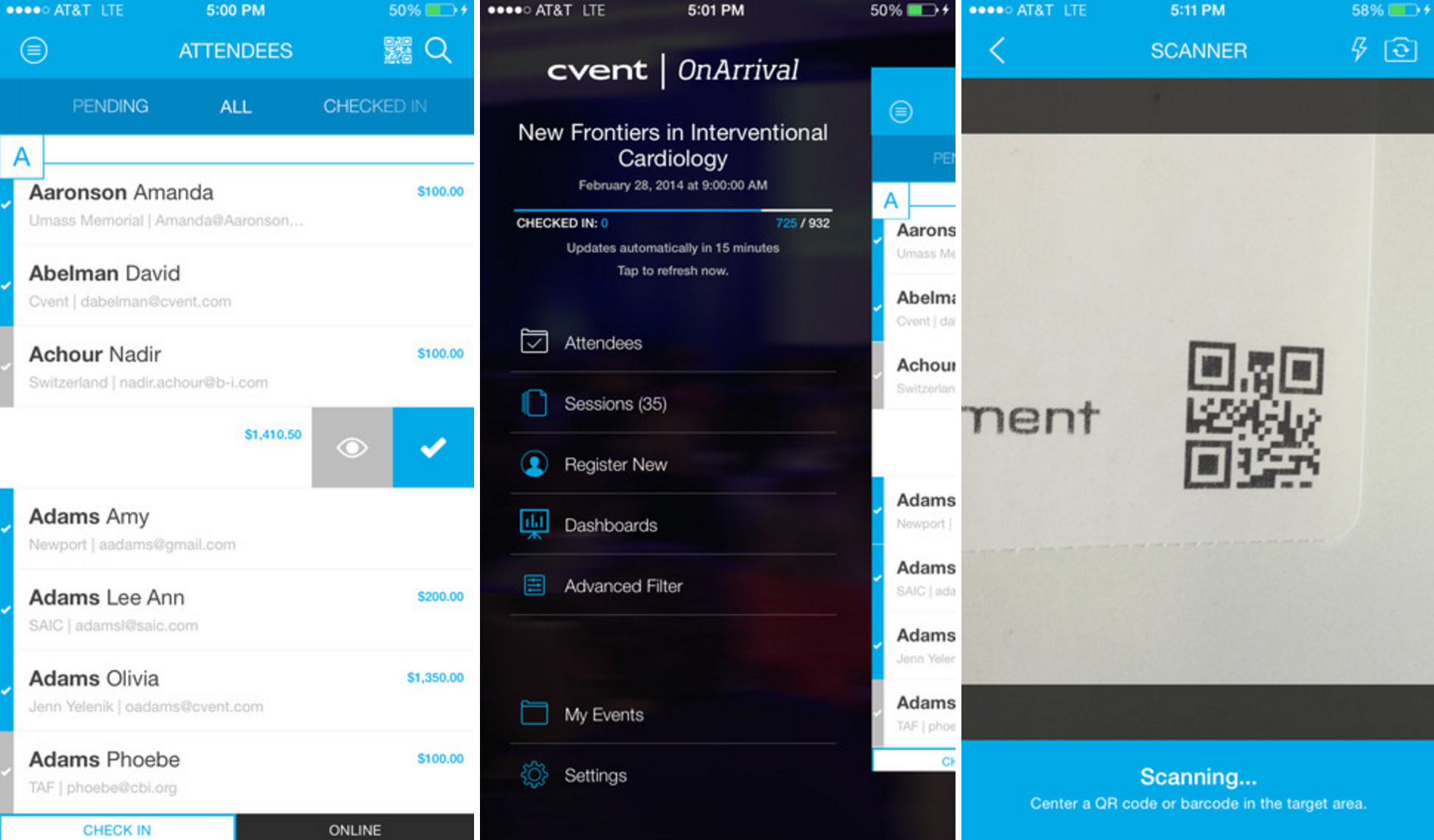
Cvent
As a behemoth in the evens industry, Cvent's app boasts a clean and uncluttered interface, perfect for planners who have a million things on their mind. That said, it takes two taps to check someone in. This is probably a measure to correct accidental taps, but I think the interface design itself can solve this problem rather than costing the planner extra time. Also, I feel that the missing comma between "Last Name, First Name" is really confusing. Simplicity shouldn't be won at the cost of good grammar.
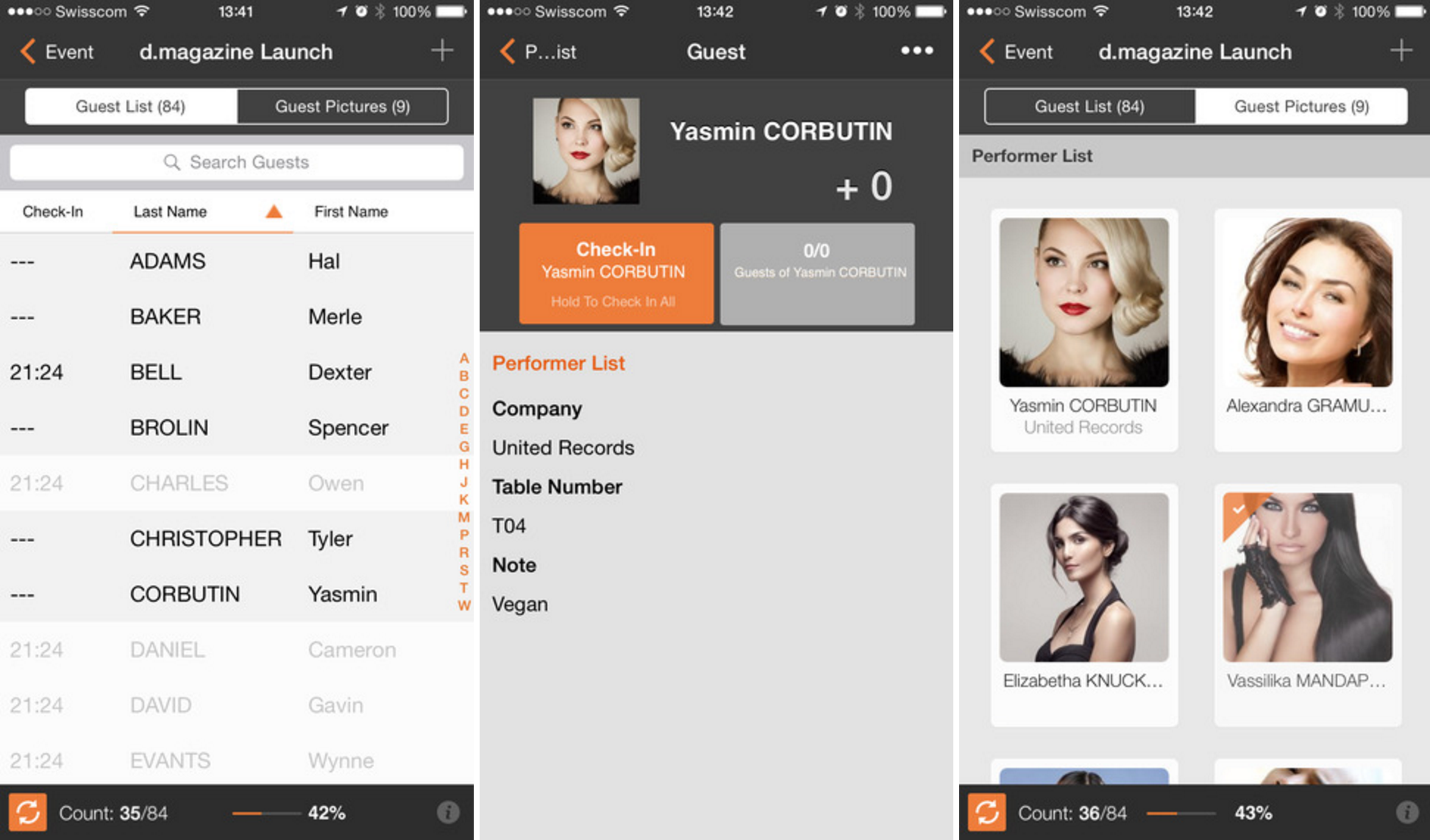
Zkipster
Zkipster, with a very interesting product name, showcases some equally interesting features. It contains a separate area in the app for VIP attendees - which got me thinking about handling notifications for preferred guest arrival. The app also treats the attendee list unlike any other product; using a table component. Everything is sortable by tapping the top bar, rather than accessing these features through a menu as others have done. That said, it's important to note that this feature may be a sort of "set it and forget it", meaning the user may not need it more than once.
It was interesting to note that Eventbrite replaced their specific check-in product with an on-site platform app that contains many event-day features including check-in. They retained a specific focus on clear and live-updating analytics, which I noted not to miss in my design.
There was also the concept of how to handle VIP guests, perhaps even setting notifications for planner to receive when a specific subset of attendees arrives. Elsewise, how much of an attendee’s personal information should be put in the hands of volunteer check-in staff, should there perhaps be a volunteer “lite mode”? The list went on:
- Types of attendees like VIPs, exhibitors, performers
- How to organize and display attendees in the main list
- What analytics to put in for the best on-the-go use in the moment
- How to filter down results for only one volunteer’s line/entrance
- Attendee Self Check-in
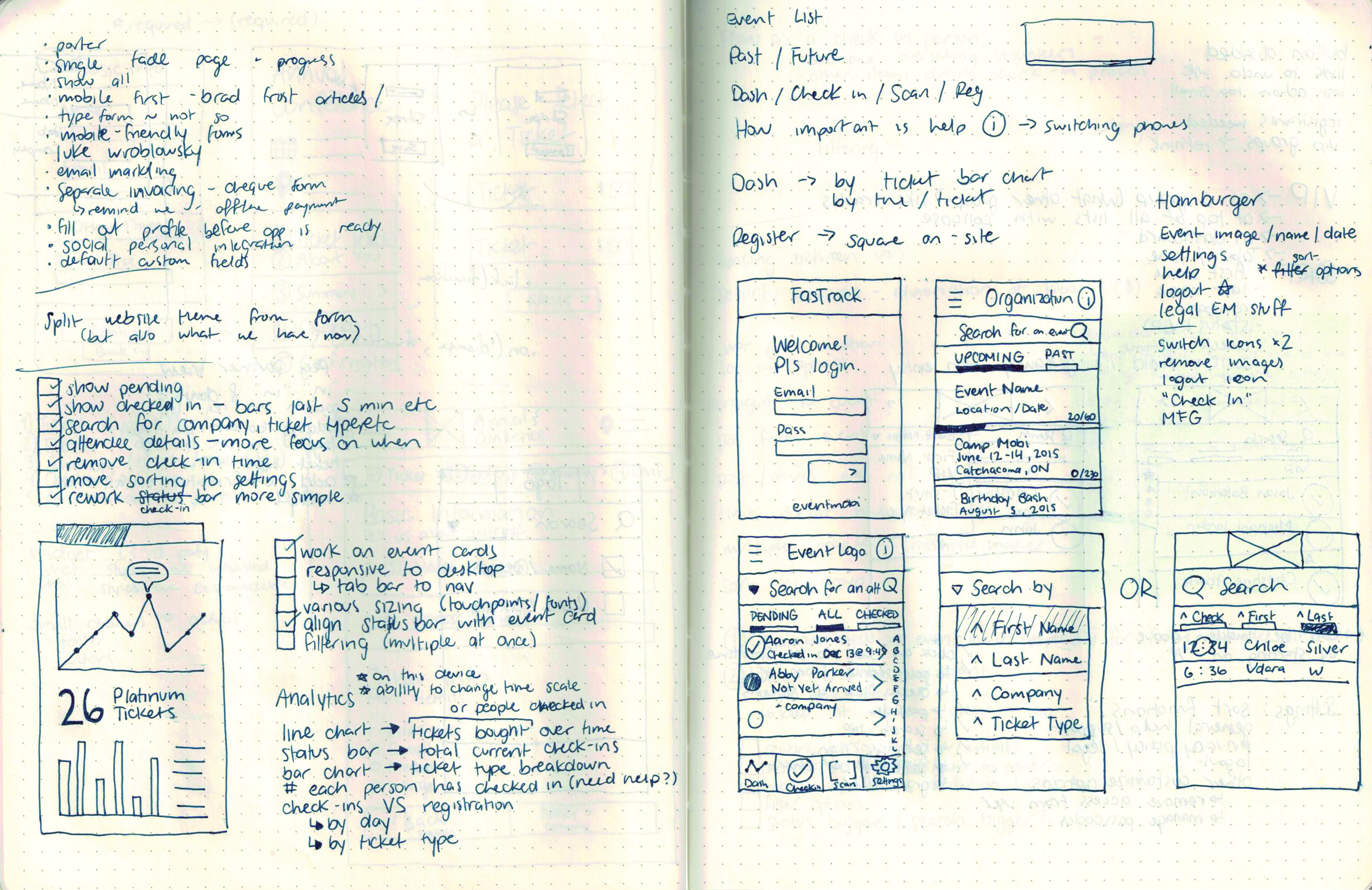
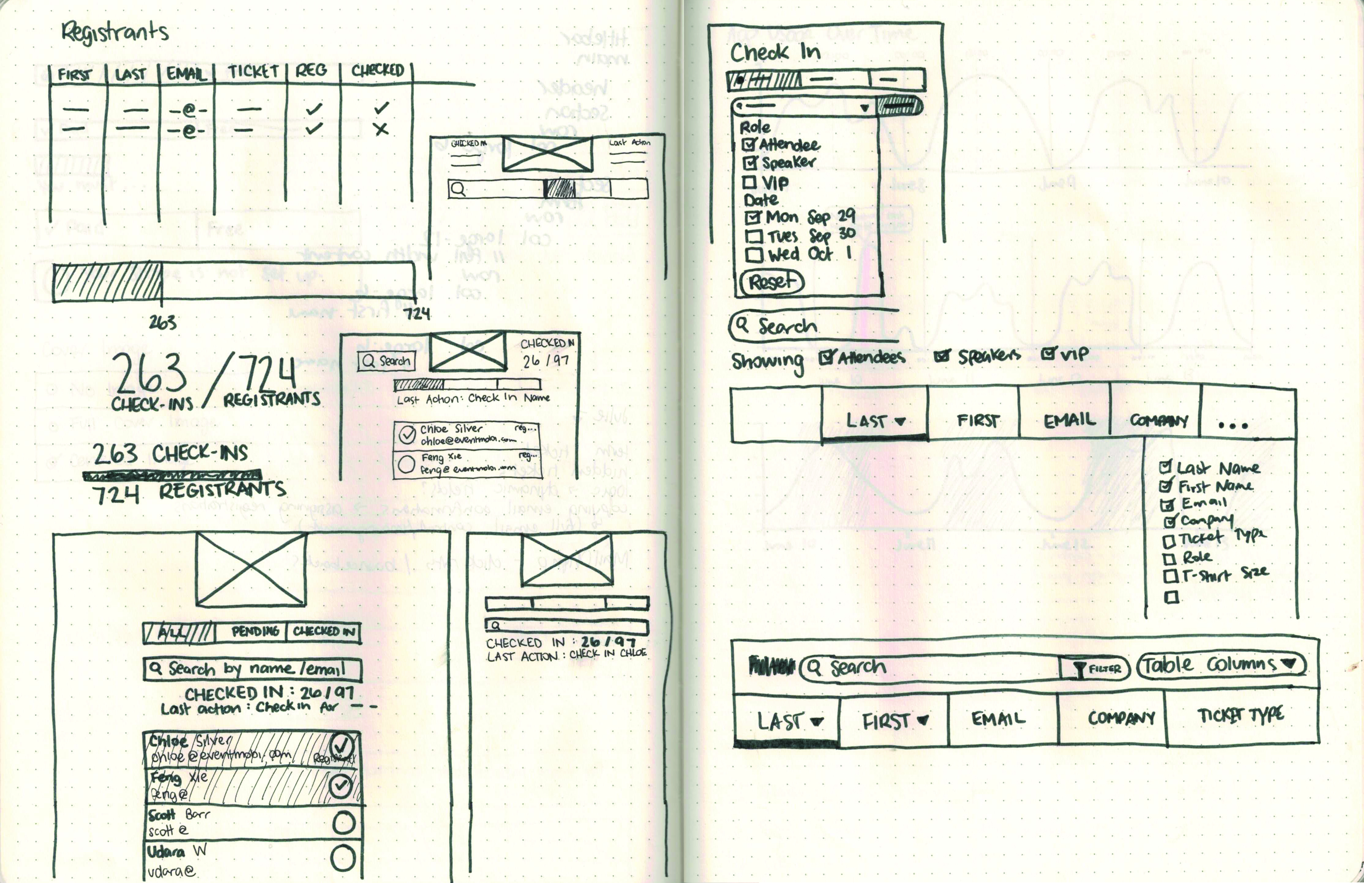
Sketches
I tested my prototype with various event planners to ensure that it was simple enough to pick up quickly, but also contained all the features the planners needed. There was little to no trouble completing the tasks during the testing, which gave me the validation I needed to put the design into the hands of planners at real events.
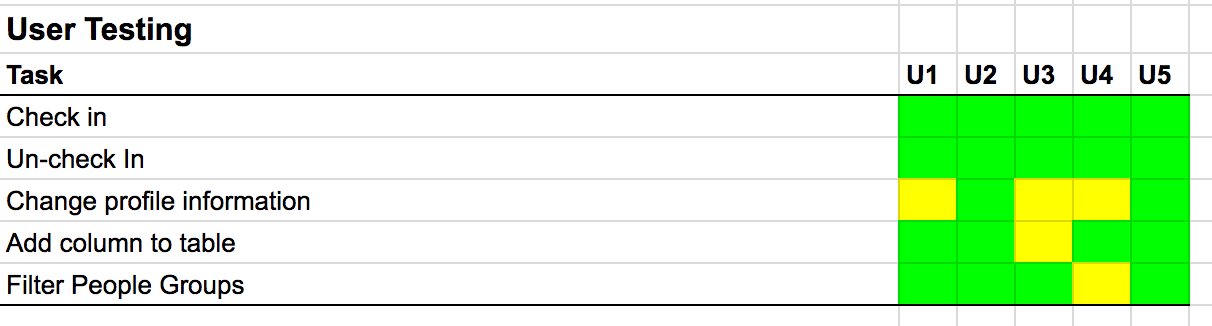
I used a modified version of the rainbow spreadsheet for my usability testing.
I was fortunate enough to be able to test the app at TechTO, a monthly Toronto-based tech meetup. So many people arrived so quickly that the app was truly feeling the strain of use. Four check-in staff (including myself) were all using the app at once, which is how we found that the attendee list wasn’t updating across devices without a forced page refresh. Not a huge pain for one event, but this would still need to be fixed.
Once we had ironed out the bugs from TechTO, I was soon given another opportunity, this time at TEDx Toronto. I was so excited to try out the check in at a much larger event with over 1500 attendees. The planner was extremely impressed with the app, especially considering she had used pen and paper the year before. All of the attendees found their seats on time and no one missed the first speaker. I’d call that a success.
Screens
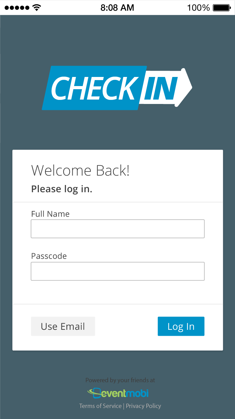
Login Page
Planners often enlist volunteers to help them with checking attendees in, and these people do not usually have their own logins. The planner needs to be able to track each volunteer's action, so the volunteer simply signs in with their name and a six-digit passcode the planner provides for them (generated with the help of EventMobi).
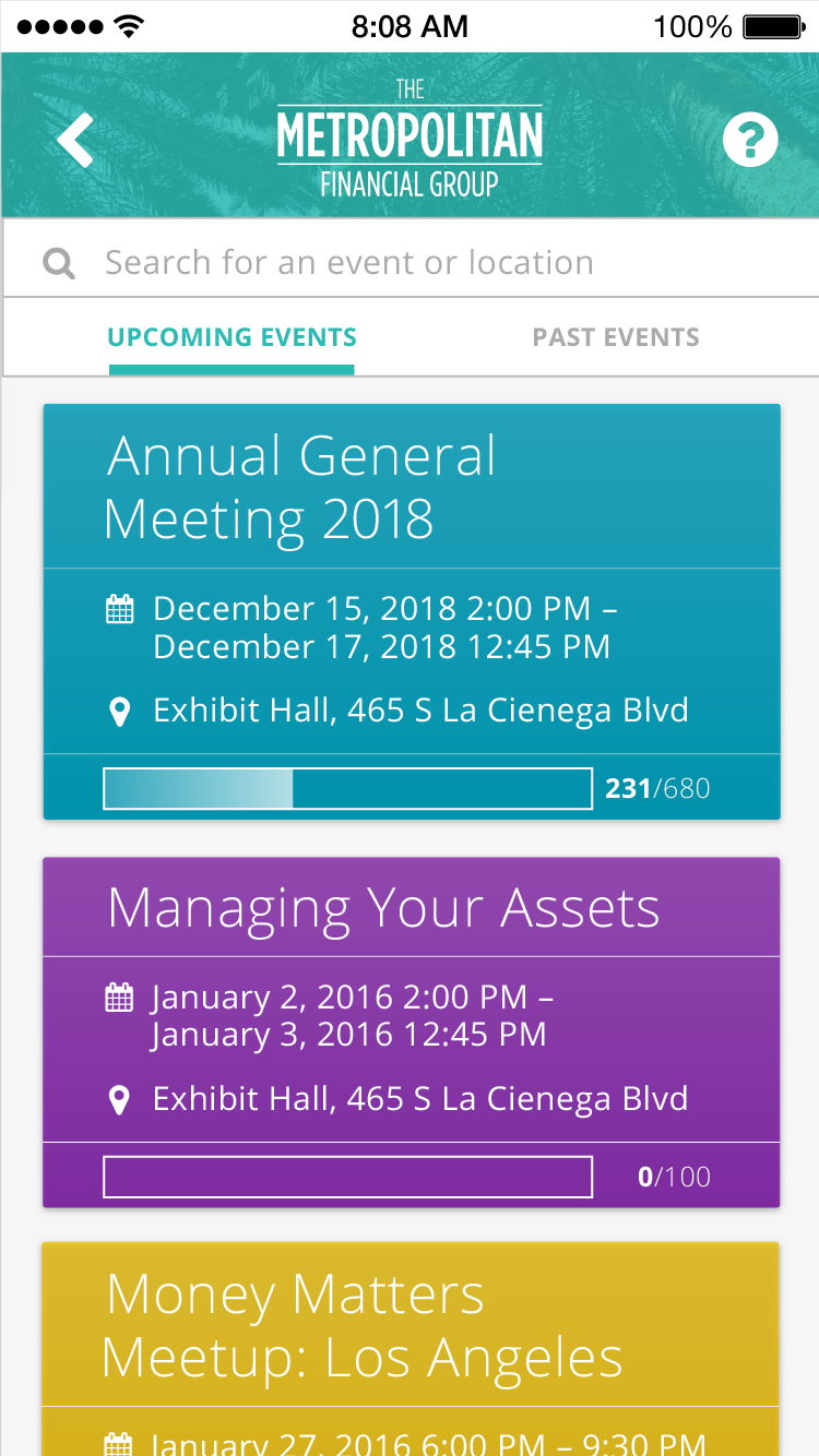
Events Page
A planner may have multiple events coming up, or even concurrent events at once, so the list is organized to display the most relevant event first. Tap any event to see the attendee list, or review the quick overview stats on the card.
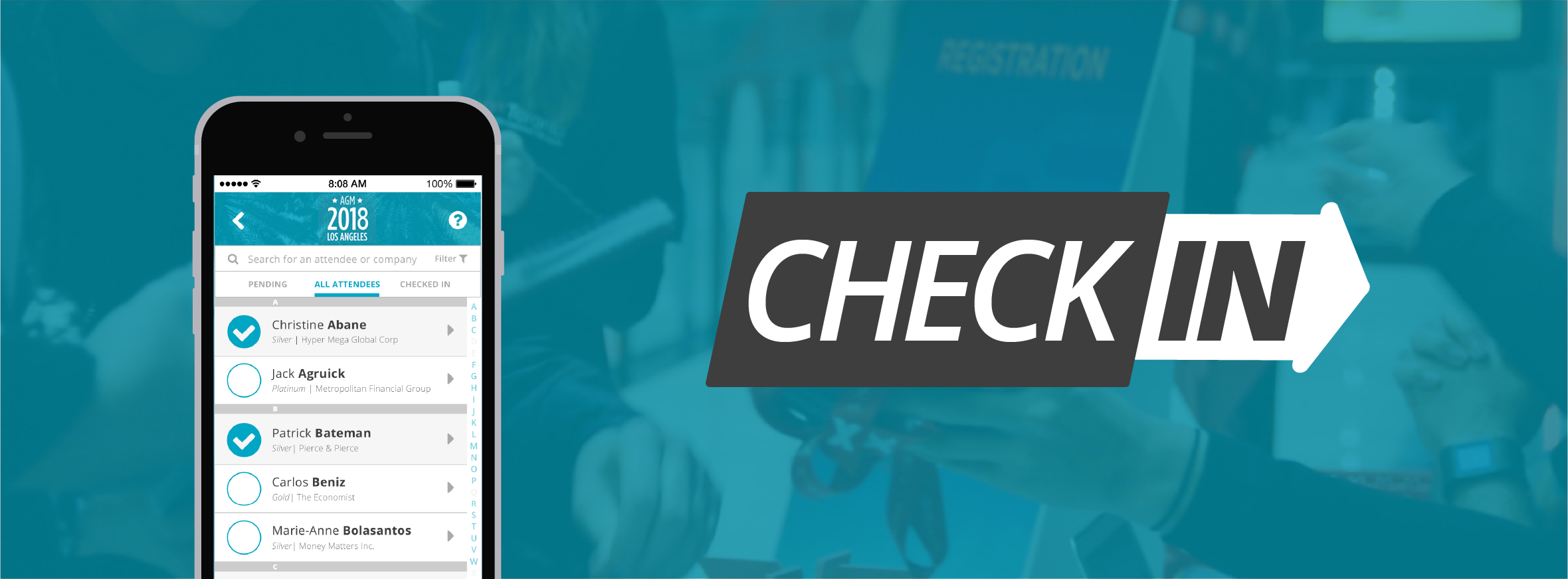
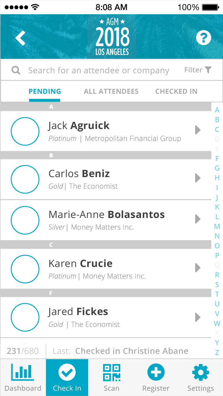
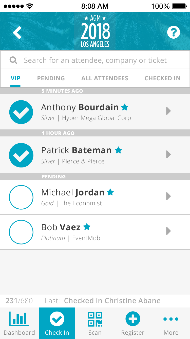
Attendee List
The attendee list is sorted by last name but can be customized however the planner chooses. They can scroll the list using the alphabet along the right side or search for a name, tap once on the circle to check them in, and they're off to the races.
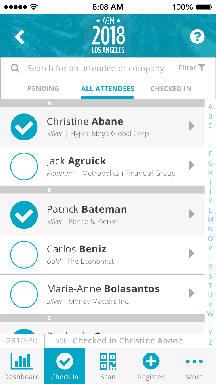
View Mode: Pending
A planner will usually want to remain in the view of only seeing pending attendees, so that they can more easily find attendees in a list that shrinks as more people arrive.
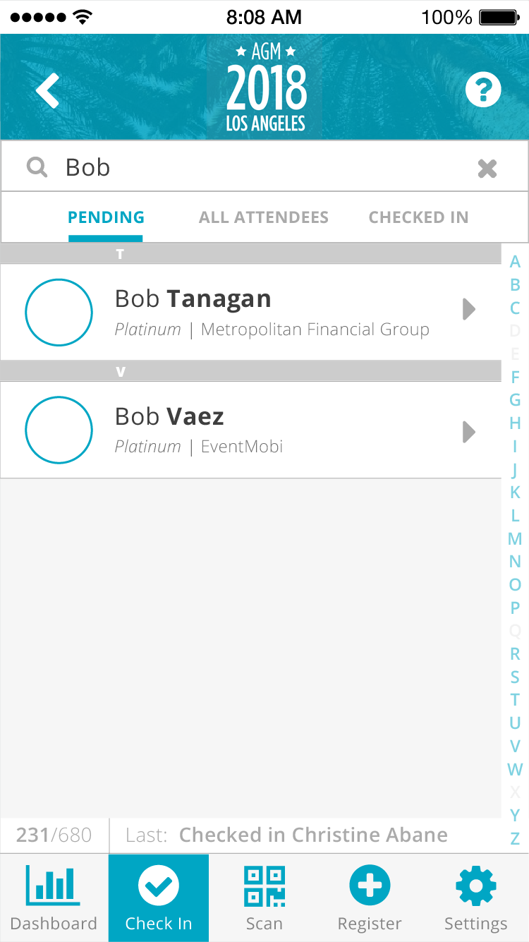
Search
As mentioned above, planners may want to search for an attendee instead of scrolling through the list. They can also search by company, title, ticket, and any other parameters. The search can remain active while they check people in, and so provides one more level of customization.
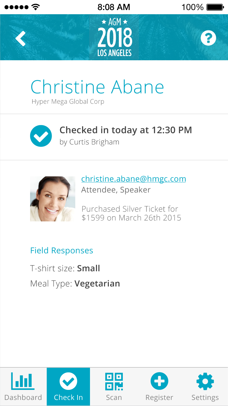
Attendee Profile
Tapping on an attendee in the list will also reveal some details about them and their ticket. For example, if they purchased a shirt with their ticket, planners would be able to see that information here and ensure the attendee gets what they purchased.
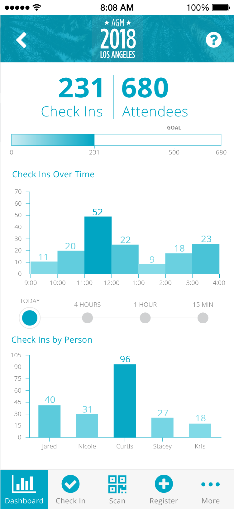
Analytics Dashboard
In the dashboard, the planner can see a brief overview of the status of their event. They can filter the view by time to review the past 15 minutes, hour, four hours, or full day. More analytics are available in the planner's content management system, but this screen is more geared towards quick views to ensure everything is running smoothly. If a volunteer is checking in many more people than others, perhaps they need some help and the planner can send someone to assist them.
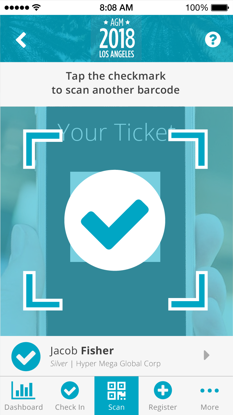
Badge/Ticket Scanning
If the planner has opted to use barcoded tickets or badges, they can simply scan the barcode into the app to check attendees in. As each barcode is scanned, the associated name will appear at the bottom of the screen in case the planner needs more details about the attendee.
VIP View
Depending on the event type, the planner may want to turn on the VIP view, which will filter the attendee list down to only guests who have been specially selected ahead of time. This use case involves the planner ensuring these VIPs are treated specially and to more easily keep track of them during the event.
Logo Design
As a fun brain exercise, I gave myself a set amount of time in which to come up with as many ideas as possible for the logo. I recorded my progress for most of the work, sped it up and reviewed it as a creative way to critique my own work and continue the ideation cycle. Check it out below:
Final Product
Check out the working prototype in action below.
I had the joy of writing about the importance of testing designs with real users in real scenarios on Medium, which you can find below. Some of my coworkers mentioned how helpful the article was for them; helping them to get the most out of opportunities to attend events to better understand our users.